When it comes to colour tips, it’s important to recognize individual preferences. Some love bold shades, while others prefer neutrals.The good news is that when it comes to colour, there is no such thing as the “right” palette.
Many of us have been in homes with a proliferation of colours that create a choppy feeling, which make us want to flee!
It would be best to hire a designer or colour consultant in order to prevent this result from happening to you. They can guide you through the process or simply help you determine what’s the perfect colour for your space.
Read on to discover professionals’ colour tips to achieve a harmonious flow of colour throughout your house.
#1 colour tip: Select Colours With a Flow-Through Effect
Connecting spaces can be made cohesive by using a consistent paint colour on their walls. “Particularly in homes that have more of an open floor plan, it’s best to choose one colour that is going to serve as your main colour or your neutral,” says Kelly Porter, an interior designer based in Washington, D.C. “That doesn’t mean it has to be beige or white or gray. But the foyer, the hallways and that main connector room should all be the same colour because you want to have that dominant colour in your space.”
#2 colour tip: Take Note of Sightlines when Picking Your Paint Colour
In addition to helping clients choose more diverse paint colours for their walls, San Francisco interior designer Jennifer Ott advises them to consider sightlines when that is the case. She says that if you are looking to add more variety to your living room, you need to consider the other rooms that you will see.
It is imperative that you choose colours that work well together in the dining room, kitchen, and foyer if you have a view of those spaces. “It can start to look really wacky if you have a different colour scheme in each room,” Ott says.
#3 colour tip: Decide Which Colour Groups to Use
Keeping your colours scheme within the same temperature range will increase the likelihood that it will flow from room to room and in a good way as well. “Some people will stick to a warm colour palette — reds and oranges and yellows or a cool scheme — grays and greens and blues,” Ott says.
When considering colour tips for your home, if you are planning to use a colour in more than one room of your house, Ott says you might try choosing several different hues of it across rooms. For instance, if your primary colour is blue, then you may choose a gray-blue, a pure blue and a navy blue as you move from room to room.
Depending on the kind of paint you choose you can ask your paint store to create a “tint” of the colour of your choice.
For example knocking down the main colour by fifty percent, which will be done by the mixer adding white. “They can create a lighter or darker version of it,” Ott says. “That’s a good way to unite without putting the same colour everywhere.”
For finding complementary colours, paint decks can also be a good source of inspiration.
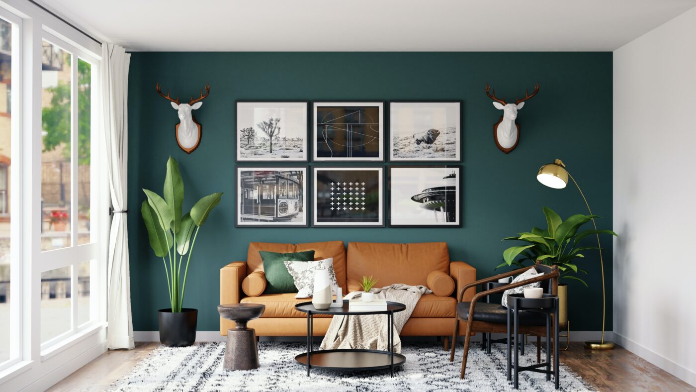
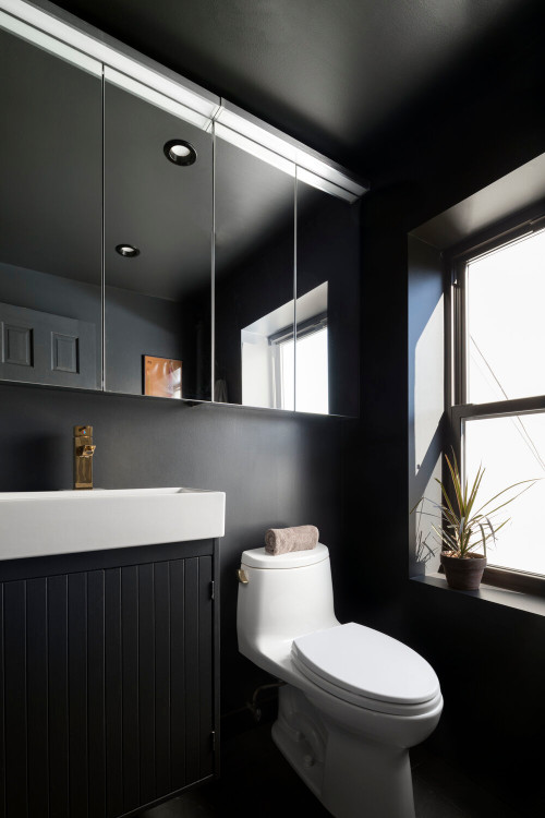
#4 colour tip: The Edgiest Colours Should Be Reserved for Enclosed Areas
This color tip is related to places in the house where you can let loose and experiment with bold choices. For example, in your master bedroom, kids’ room or any other room enclosed in four walls that are out of sightlines of other rooms, says Carl Mattison, a designer based in Atlanta. Explore these colour tips for areas in your home where you can unleash creativity with bold choices.
According to Carl Mattison, a designer based in Atlanta, spaces like the master bedroom or kids’ rooms offer opportunities for experimentation. “If you turn the corner and go into a little powder bathroom, which you don’t go in all the time, who cares? Paint it black!” It works, Mattison says, “because it’s its own little box.”
#5 colour tip: When It Comes to Bold Paint Colours, Use Accessories
You can introduce dramatic colours more easily with accessories. They are less expensive than a couch or rug in the same tone, and they are also easier for you to swap out should you get tired of them. As well as preventing the shock effect that can occur when you paint the entire room with a dramatic shade, limiting bold colours to accessories helps to avoid the shock effect that can result.
“The key is finding a way to inject the colour that makes rooms interesting and exciting without feeling like you need to escape,” Ott says. The use of bright colours is good when you’re trying to draw attention to a piece that deserves to be noticed.
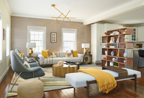
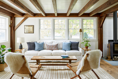
#6 colour tip: With Accents, You Can Tie Your Rooms Together
In order to create a sense of continuity throughout the home, accent colours can vary from one room to another. However, they can be consistent throughout the entire home if continued consistently throughout.
“Let’s say you have green and blue in your living room,” Porter says. “Perhaps for the dining room, you use one of those two colours, maybe just the blue. Or you could do blue and yellow. So the blue is what will tie those rooms together.”
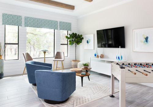
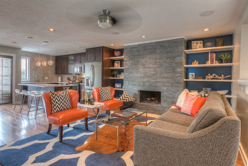
These are the two rooms in the previous photo and the one in this photo, which both belong to the same house and illustrate this concept in a very effective way. The main accent colours in the first photo are green and blue, while the wall colour is white, and they carry through to this family room, creating a cohesive design.
These are the two rooms in the previous photo and the one in this photo, all belonging to the same house, illustrating this concept effectively. The primary accent colors in the first photo are green and blue, complemented by white walls. They carry through to this family room, creating a cohesive design. This serves as a good example of how these color tips can seamlessly tie together accent colors throughout the house.
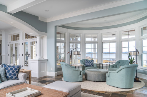
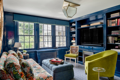
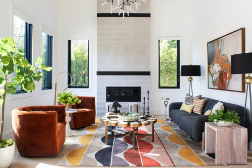
#7 colour tip: Make Use of the 60-30-10 Formula
You can also create a cohesive flow of colour from room to room with these colour tips by treating your home’s palette like a math equation. “Use a base colour that you really like as 60% to 70% of what you’re going to paint for your interior,” Wardlaw says. “Your next colour needs to be 25% to 30%. Then you can do your accents of 5% to 10%.”
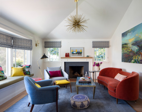
Taking a look at this photo, which shows one Wardlaw’s designs, it can be seen that there is a 60% gray colour, a 25% blue colour, 10% orange colour, and perhaps 5% brown. “I really try to make people only go with about three colours, four at the max — at least on the interior,” Wardlaw says. “Otherwise it just feels chaotic.”
There is also the possibility of using a variation of the scheme in another area of the house, such as a separate dining room. The walls may be painted blue, and gray can be used as an accent colour, while a few small orange accents provide the 10 percent dose of colour. “As long as you keep it cohesive throughout your entire home, it’s going to make more sense,” Wardlaw says.
#8 colour tip: Plan Your Colour Scheme With Colour-Planning Tools
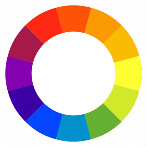
If you are interested in delving further into design principles, you may want to read up on a bit about colour theory – or at least ask your interior designer about it if you don’t know what it is. “One of the main things I explain to my client is the colour wheel,” Wardlaw says. “To keep that cohesive feel throughout your home, one of the main things you can do is consult that.”
Generally, with these colour tips, using colors analogous to each other on the colour wheel yields a room with more contrast and a calming atmosphere. Conversely, employing complementary colours (across from each other on the colour wheel) creates a more energetic space with greater contrast. Understanding these relationships between colours helps you comprehend why certain combinations have different effects on you.
The Best Way to Get a Well-Designed Look is to Hire an Expert
In decorating or remodeling your home, a designer can offer valuable advice and guidance based on the fact that they have studied colour. If you need an interior designer, you can hire one to help you from start to finish, or simply to assist you in troubleshooting a particular area in your home, like tweaking the colour scheme of your home so that it flows seamlessly.
There are so many colour options available today, and Porter understands the importance of keeping her clients informed. A client who had a blue passion for colour, and wanted to make sure the colour she chose would produce the desired effect, was one of her long-distance consults. “The colours she was telling me about were very bright and childlike,” Porter says. The designer suggested a more adult rusty orange instead. “She tried it and loved it,” Porter says.
With all those colour tips, are you ready to give your home a more vibrant color scheme?
If so, consider hiring a professional painting company to help you achieve what you desire while staying within your budget.