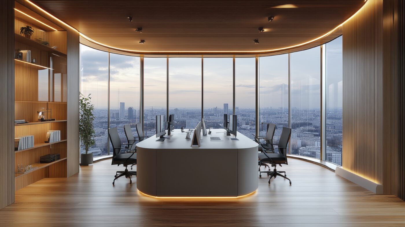
When it comes to transforming your business environment, understanding the latest commercial painting trends can make all the difference. Not only do colours set the mood and create a first impression, but they also influence productivity, brand perception, and overall client experience. In this article, we’ll explore five commercial painting trends that are perfect for adding distinctiveness to your commercial space.
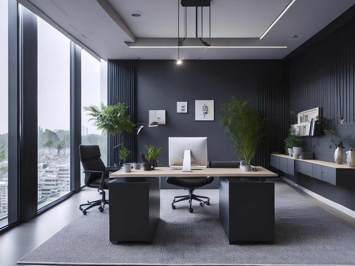
1. Dark Grey: Serious and Sophisticated
Dark grey is a top choice in commercial painting trends for creating a serious and high-contrast environment. It’s perfect for law firms, financial institutions, and tech companies. This colour adds elegance and modernity, especially when paired with white or metallic accents.
Why It Works: Dark grey offers a sleek, professional look that serves as a neutral backdrop, adding depth without overwhelming the space.
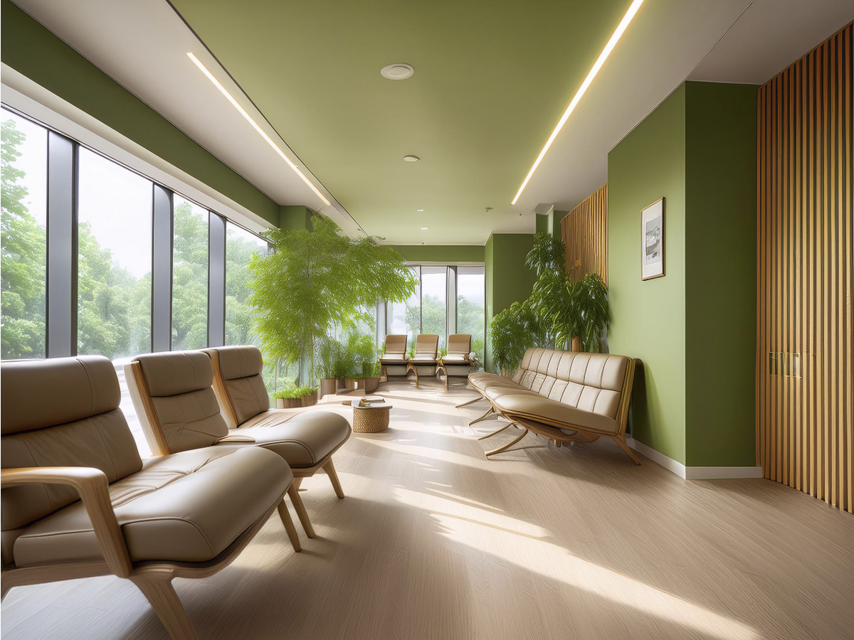
2. Light Olive Green: Refreshing and Calming
Light olive green is trending for its refreshing, nature-inspired feel. It’s ideal for offices and healthcare settings where a calming atmosphere is needed. This colour promotes relaxation and reduces stress.
Why It Works: Olive green adds warmth and a natural touch, making high-stress environments more soothing. Pair it with natural wood or beige for enhanced relaxation.
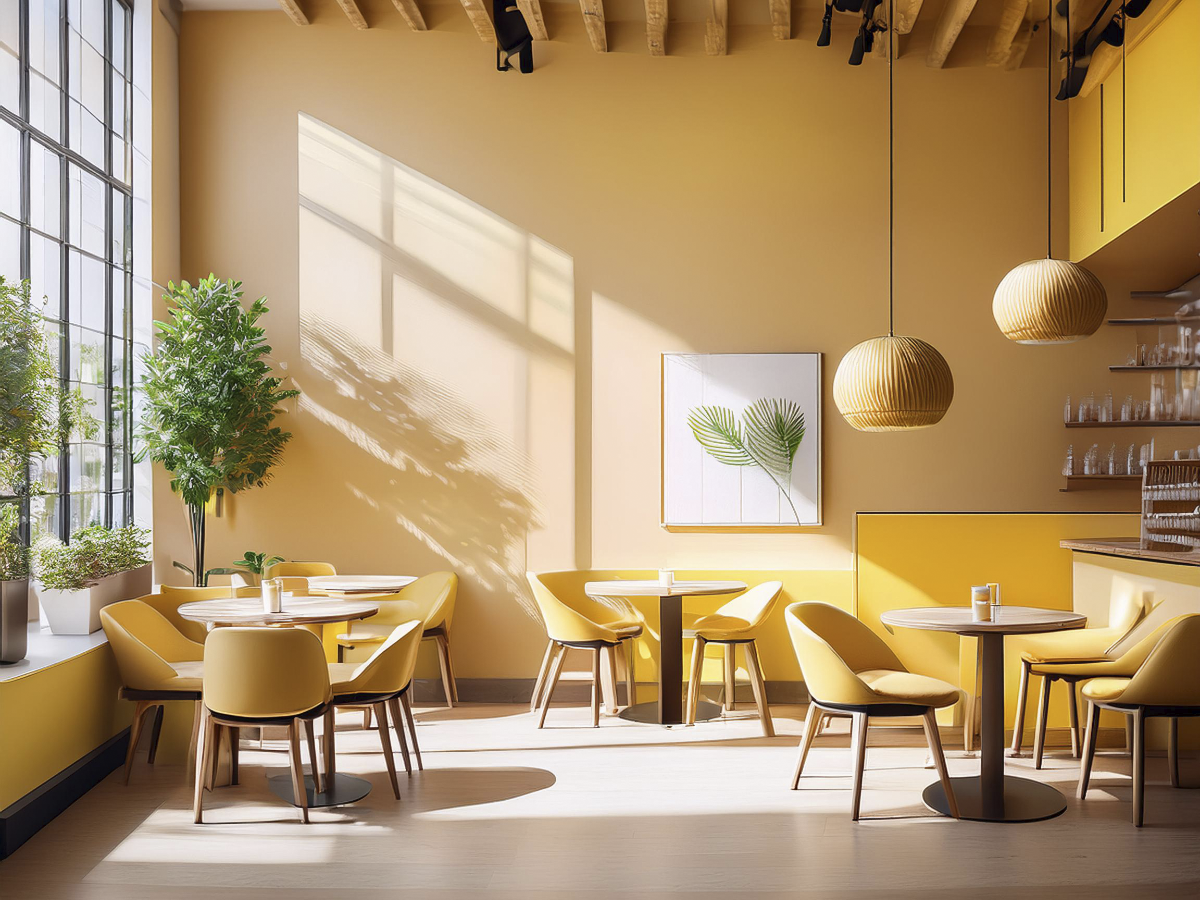
3. Neutral Yellows and Beiges: Warm and Inviting
Neutral yellows and beiges create a warm, welcoming atmosphere, perfect for retail stores and cafés. These colours make spaces feel larger and more approachable.
Why It Works: They create a friendly and comfortable ambiance and pair well with other colours, making them versatile and effective.
Depending on your industry, certain colours may work better than others. For more insights, check out this Comprehensive Colour Guide for Commercial Painting to explore additional expert tips and ideas.
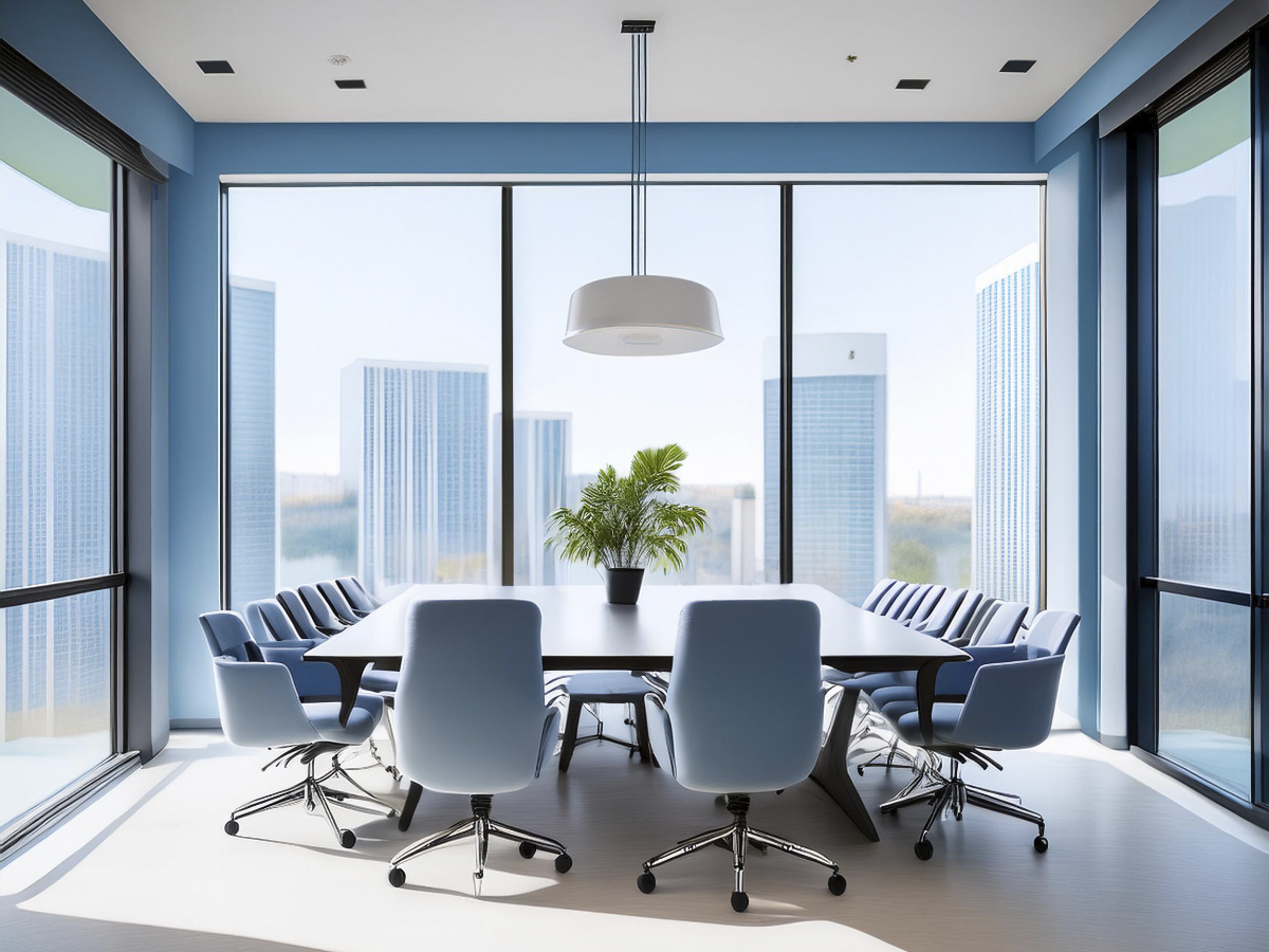
4. Soft Blues: Calm and Professional
Soft blues are popular in commercial painting trends for their calming and professional qualities. They work well in offices and conference rooms, promoting focus and clarity.
Why It Works: Soft blue fosters tranquility and reduces stress, enhancing productivity while maintaining a professional look.
5. Warm Terracotta: Energetic and Engaging
Warm terracotta adds energy and warmth, making it suitable for creative industries like design studios. It pairs well with natural materials for a vibrant look.
Why It Works: Terracotta stimulates creativity and interaction, perfect for spaces that need an energetic atmosphere.

Before starting your new colour project, make sure your space is ready. For tips on how to prepare, check out our guide on How to Prepare Your Space for Commercial Painting Contractors to ensure a smooth process.
Looking to transform your commercial space with trending colours?
Selecting the right colours is crucial for enhancing your commercial space. From sophisticated dark grey to vibrant terracotta, these commercial painting trends can help you create the perfect environment. Are you in the Lower Mainland and looking for expert advice on commercial painting? Let us help you transform your space. Get in touch with us now!
