When it comes to choosing ceiling paint colour, there are countless subtle shades available, including classic white for your walls. However, there’s no definitive right or wrong way to paint a ceiling.
It is very important to know about all of your options because if you overlook them, you might be making a mistake that stays with you for many years to come. The following tips will help you choose a ceiling paint colour that best suits your design, whether you prefer a ceiling that blends in with your walls, coordinates with them or contrasts with them.
1. White Ceilings Paint Colour
As far as coating the ceiling with a crisp white paint goes, it is easily one of the most popular and safest options, and it certainly isn’t a bad colour choice to stick with. Yet there are many elements involved in getting a crisp white paint finish.
Generally speaking, when you have a room with white walls without any noticeable undertones, a similarly untinted white ceiling paint color will also work well in creating the illusion of a gallery-like experience.
There are, however, certain things to take into consideration if your walls aren’t pure white. For instance, you need to consider how the tones of the two surfaces will appear next to each other, whether to match or contrast, or whether to go somewhere in between.
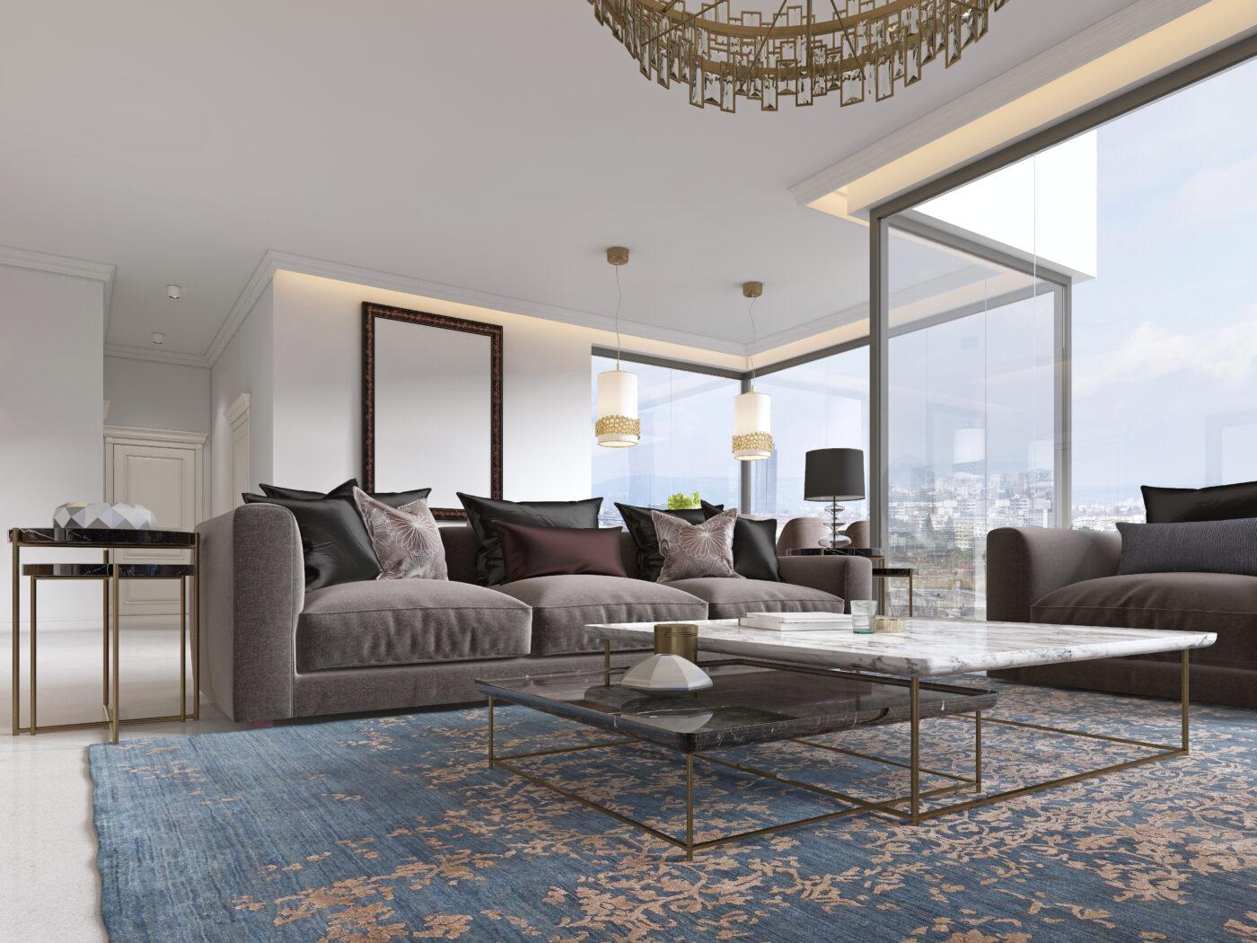
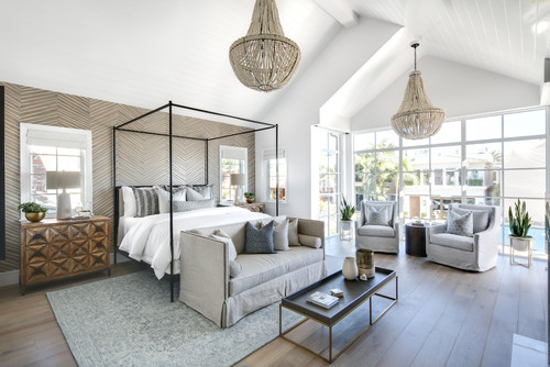
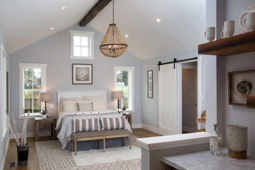
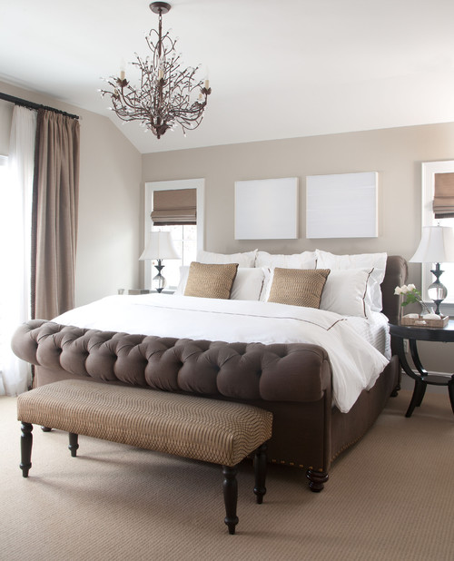
2. Ceiling paint colour That Match the Walls
Choosing an off-white or watered-down shade of white as the color of your walls is the easiest way to create that natural warm tone you want, and the best solution is to use the same shade for the ceiling paint color as well. In the example above, you can see that the walls and ceiling are all the same shade of white, resulting in giving the room a bit of texture.
By using the same color on both the walls and the ceiling, the visual emphasis is placed on the other features of the room, such as furnishings, architectural elements, and artwork, instead of the points where surfaces meet.
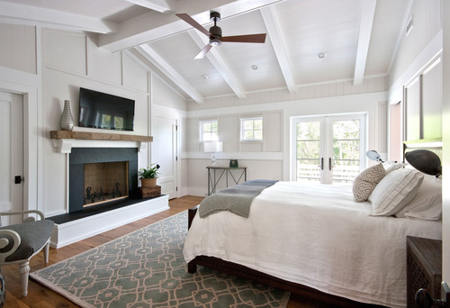
Even with bright white moldings, still, less contrast between walls and ceiling helps moldings blend in. Using the same pale neutral color throughout helps creating a consistent and serene interior.
That said, richer colors on the ceiling tend to shrink the space. However, in tall rooms or for a cozy atmosphere, this may not be a concern.
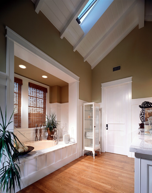
3. Ceilings Tinted with Matching Paint Color to Coordinate With the Walls
Even with bright white moldings breaking up the walls and ceiling, minimal contrast between them allows the ceiling to blend away, enhancing the moldings’ visibility.
Using the same pale neutral color throughout the home creates a serene and welcoming interior, especially when maintained consistently across all spaces.
In some cases, depending on your style, you may be better off choosing a paler shade of your wall colour from the same family. Choosing what’s essentially a lighter shade of your wall colour guarantees that it will look coordinated.
When it comes to bold hues, selecting a single off-white shade from the same paint chip for your walls may not be feasible. Instead, consult a painting professional or knowledgeable paint store associate for a custom formulation based on your wall colors.
At home, then swatch it. If it doesn’t work, adjustments can be made much more easily than if you were to mix your own concoctions.
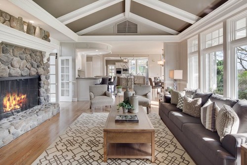
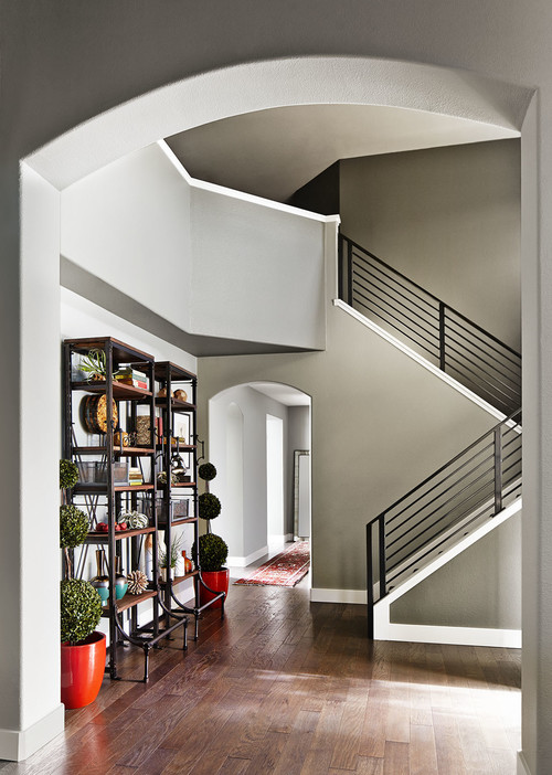
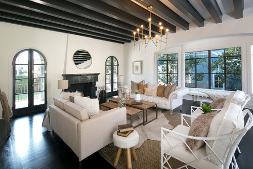
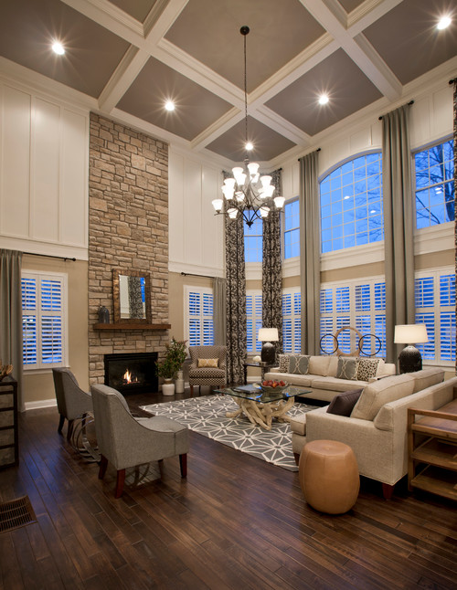
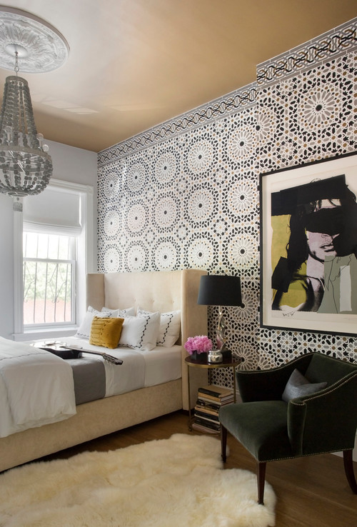
4. Ceilings Darker Than the Walls
Adding the same tint to paints can have the opposite effect of highlighting the architecture and creating a more intimate atmosphere. This is evident in the dark color used in the ceiling cove in this dining room.
It’s important to note that this accent shade wasn’t chosen randomly. Its tones match the color of the walls and the white trim on the doors and moldings of the home. The trim color was likely chosen simultaneously with the ceiling color to avoid subtle conflicts.
By using a neutral gray for a dark ceiling, you can create a livable atmosphere without adding color undertones. This choice is ideal for those who want a bold look without the risk associated with vibrant hues, especially in areas where repainting is challenging.
When selecting a neutral gray, it can be challenging to find the right shade in-store. Colors may appear differently when applied, so it’s wise to swatch a few options at home and order oversized swatches to see them in person before committing.
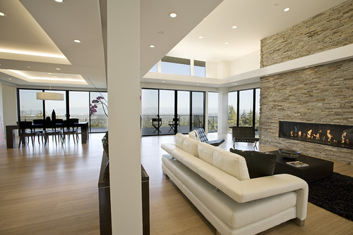
5. Ceilings as a True Accent
Sometimes, a striking effect can be achieved by contrasting the ceiling with the walls. For instance, this living room features deep espresso brown ceiling coves against warm-toned walls, creating a distinct contrast. Coordinating such colors can be challenging, but various strategies can help.
One approach is to swatch the colors together on a long plank to visualize how they interact. Starting with suggested color combinations can be helpful, but it’s essential to assess how they appear in your home’s ambient light.
As a second tip, consider matching the ceiling paint color to the wall treatment for a seamless look. In this case, the ceiling is the same color as the walls.
Alternatively, select fabrics or artworks with similar shades to replicate the texture for coordination. Keep in mind the ceiling paint color’s visibility, so choose a neutral shade for a polished appearance.
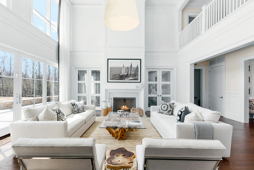
6. Crisp White Ceilings for Contrast
In order to achieve a positive contrast with the walls, let’s go back to where we started and talk about pure white. A pure white ceiling can look perfect despite not matching the colour of the walls so far as the other elements in the room are white such as white linen and other accents.
Having a pale beige wall paired with a bright white ceiling makes the wall colour stand out much more. By doing so, it gives this traditional townhouse a sense of freshness that wouldn’t work in a less modern home, yet would give it the feel of something very modern.
A purely white ceiling adds a touch of class and elegance to an otherwise plain space, especially when combined with a mix of warm and cool neutrals, such as brick, wood, and even black window trims. The white acts as a middle ground between the diverse colours used in the room.
3 Questions to Ask Your Design Professional Before Choosing Ceiling Paint Colour
1. What kind of paint finish are you going to use on the wall? (There are options that can highlight and others that can mask, so it’s important to know what you are going to use.)
2. In addition, will you also paint the crown molding or ceiling medallions? If yes, what colour or finish will you use?
3. What kind of atmosphere will the colour of paint create? If you want a cozy feel, you might want to use darker colours. If you want an airy feel, you might want to use lighter colours.
Choosing the best paint colour for your home or business can be a daunting task without the help of a professional painting team. Contact the Goodwell Painting team today for a free consultation.